Cross-device experience
Read time: 12 minutes

Company:
Onfido — London
My role:
Product Designer
Timeframe:
Three months
Skills:
Research analysis, UX/UI design, workshopping, usability testing
The problem
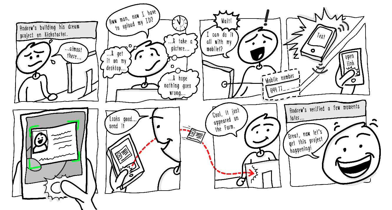
What do you do if you’re applying to a service on desktop and you’re being asked to verify your identity — and you don’t have ID photos saved anywhere or a webcam to use? Most people would reach for their mobile, take a photo of whatever is needed, and then figure out a way to transfer the photos back to their desktop to upload.
We knew from client feedback and previous usability sessions that this was a cumbersome experience and was contributing to a 30% desktop drop-off. We wanted to create a much better experience for users to take ID photos on their mobile and remove the friction of transferring those photos back to their desktop to continue verification.
TL;DR
The solution
As most desktop users usually reached for their mobile phone to take photos, we decided to "piggyback" on this pre-existing user behaviour. Introducing the ability for users to continue their verification journey from the desktop to their mobile to take photos greatly reduced drop-off opportunities that usually ocurred.
We achieved this by:
- Providing SMS support to allow users to switch to their mobile (users are familiar and comfortable with this behaviour)
- Providing clear instructions and user feedback to let people know how it worked and what was happening at all times
- Understanding how people move between devices, what can happen in this transition, and how we can support them
“Azimo and RBS were totally blown away by this. They got the benefits straight away.”
Read the in-depth casestudy below 🤓
A little context
Background
Clients (such as Revolut and Blockchain.com ) integrate Onfido’s SDK into their own applications so people can quickly verify their identity, create trust in their platforms, and meet KYC (Know Your Customer) government regulations.
When I joined the team the Web SDK was in a very basic MVP state. Team focus had been shifted to the iOS and Android versions of the SDK and so the web version had become neglected — clients weren’t excited about it and our sales team failed to be excited to sell it. From talking to sales, the customer support team, clients, and observing users struggle with the desktop flow we believed that the "cross-device" was a feature that would get clients and sales excited about the Web SDK again.
SDK sidenote
I know most people have no idea, or only a vague idea, of what an SDK is (I definitely fell into the “vague idea” side) — so let’s clear it up. An SDK (software development kit) is a “plug-n-play” kit that clients can add into their existing products meaning they don’t have to spend the time and resources building it themselves. Our identity verification SDK allows clients to focus on what they do best and leaves the customer verification part to us.
How the Web SDK worked
Identity verification is a 2-step process for the user — take a picture of an ID document followed by taking a selfie. Machine learning algorithms then validate the ID document and match the selfie to verify the user's identity. Desktop users were dropping off at the points in the flow where they needed to upload pictures of their document and face.

Working assumptions out
Research
Meeting assumptions head on
I realised at the beginning that we were starting with some large assumptions:
- A large proportion of desktop users take ID photos with their mobile and transfer them back to their desktop to upload
- Most users find it more natural and convenient to take photos using their mobile
- The majority of desktop users don’t have an ID document image saved anywhere for easy access
The early part of my research phase was validating these assumptions using a variation of methods such as looking through usage data, desk research, and user testing our current SDK product. Top level insights from this research showed that:
- ~50% of our Web SDK users start their journey on desktop
- ~60% of desktop users have access to a webcam
- Most desktop webcams are not useful for capturing decent-quality document images
- Safari didn’t support webcam use
- It’s harder for users to keep an ID document steady in front of a webcam, than it is to take a photo of an ID document with a mobile
The trouble with desktop
Unless a user has an ID document saved somewhere then we didn’t help users in any way who needed to take a picture of their ID document and upload it to the desktop.
We knew that ~60% of desktop users have access to a webcam, but we had decided not to allow this option for ID documents. Why you ask? We had four good reasons:
- Most webcams produce poor quality low-resolution images
- Our machine learning needed good resolution images to be able to compare facial images and flag fraudulent documents
- Usability sessions continually showed that taking photos with a webcam was cumbersome and frustrating
- Apple’s Safari browser did not actually support webcam use (only recently did Safari allow webcam support)
This meant that for the majority of desktop users taking photos on their mobile was the only option available, so allowing users to easily switch from desktop to mobile and back again was imperative to avoid drop offs.
Validating the client need
In conjunction with early research, we also validated the feature with current and potential clients to be confident that this was of value to them. Working with my Product Manager we sent a survey to current and potential clients to uncover their expectations, we then followed this up with interviews to dig deeper into the problem space.
Client insights
- All were experiencing drop off numbers on desktop and recognised this was mostly due to users having to switch between desktop and mobile to take photos
- All had ideas about how to solve this problem, but none had moved forward due to the time and resources needed
- Coinbase was mentioned as having solved this problem already
Storyboarding
The concept
Not every project needs a storyboard, but I felt it was needed here to help the SDK team, internal stakeholders, and clients visualise the desktop users problems and how our concept could help them. This shared artifact lead to excited discussions about what we wanted to achieve as a business, how users could interact with it, and how this benefited clients.
Researching competitors
A big question
Competitor research
Only one of our competitors (Mitek) had tried to tackle this problem so far, but we heard that their solution required time to implement on the client-side — we knew if our solution worked “out-of-the-box” this could easily drive more clients to use Onfido instead.
We knew of only two in-direct competitors who had tried to solve this problem — Coinbase and Airbnb.
Coinbase
The Coinbase solution was being mentioned quite a bit in client conversations and we were also hearing from people within Onfido to “just do it like Coinbase” as the quick solution.

Positives
- Simple flow
- Sent URL to users mobile using their number supplied at signup
Negatives
- No image quality validation on photos eg. blurriness, glare, etc
Goal
- Goal-wise Coinbase’s flow was the same as ours — we wanted desktop users to switch to their mobile to take photos and then continue their journey back on the desktop.
Airbnb
It was fortuitous that at the same time Airbnb released a similar feature and after reviewing it I realised that this was the baseline standard of user expectation.

Positives
- Clear explanations of what was expected and why
- Good use of illustrations to help understanding
Negatives
- Pushes user to install / use app
Goal
- Airbnb’s goal was to push people to install the Airbnb mobile app or to switch to using the app if already installed.
THE BIG QUESTION
What can push my design a step further to help people?
Our design could go one step further than these solutions. I could delve deeper into how people interact between devices within their environmental space and improve the experience that people encounter switching between devices.
Answering the question
Exploration
High level exploration
My major insight from analysing the Coinbase and Airbnb flows led to me begin a high level exploration of how users move in spatial space between a desktop and mobile and what could impact them. User questions I wanted to started exploring were:
- How could their surrounding environment affect them?
- How could their attention be affected by the surrounds?
- How could their emotional state affect them?

“The future of UX is the user who continues across many devices and completes their task with little recognition of, or interest in the complexity involved. We need think at a higher level than screens or sites or devices.”
User stress-cases
Brainstorming with the team we came up with some user stress-cases about what could happen to users switching between desktop and mobile.
Distracted by external factors
- Doorbell ringing
- Phone call
- Kids fighting
- Busy work environments
Emotional factors
- Stressing about doing the verification correctly
- Having a bad day at work
Switching tasks
- Searching for their passport
- Searching for their mobile
I incorporated these stress-cases into a user journey map noting where they occured and started exploring simple and effective ways to help these users within the framework and constraints of an MVP.

Sketching out what I now had in my head and getting the team to critique it uncovered technical and conceptual questions that needed to be explored more as a team.

Testing the concept
Once the team was aligned with my concept it was time to see how users would react to it with some low-fidelity prototype testing.
There were two main question I wanted to answer with these sessions:
- Would users understand what was going to happen when they saw the cross-device option?
- How did they feel about the three different methods (copy and paste a link, emailing link, SMS message) of switching to a mobile?

User insights
- A clearer explanation of the cross-device feature was needed
- Most preferred the cross-device option to be part of the current upload screen
- Users wanted feedback on the desktop that their mobile photos had been synced
- Most preferred the ease of using SMS and weren't concerned about providing their mobile number
“You’re making me do half the work!”
Client insights
- How long would the URL link last for?
- Could email be used like Slack’s “magic email link”?
- Could the they customise the SMS message that users were sent?
- Could a safe and secure link be established between the mobile and the desktop?
“This could be a real differentiator. It shows you are really thinking about the problem, and tackling it.”
Crossing the device divide
The challenges
Switching users from desktop to mobile
From a technical point of view the biggest challenge was what method we would provide the user to switch to their mobile. We had a few options available:
- User instructions for what to do (easiest to implement — though crappy UX!)
- URL to copy and paste onto mobile (technically easy)
- Email (easy/medium)
- SMS (unsure)
- QR code (too many unknowns)
SMS obviously was our preferred option after the user testing results, but technically we were not sure if this could be implemented in time. For the MVP we decided to give users the options of “email link to mobile” as the primary method and the “copy link” as the alternative method. We felt this was technically achievable and a good UX middle-ground option for the first iteration.

Make America great again
Disagreement with this decision came when I discussed it later with our Head of Design (who is based in San Francisco). He strongly believed that SMS would be the expected option by our U.S. clients and could damage our fledgling reputation in the U.S. market if not included. My opinion was that this was just an MVP to learn from, we had a very tight deadline, and the decision to go this way had been made as a team. After this conversation I had a chat with my Product Manager about these new insights from the U.S. and he was of the opinion that we couldn't realistically deliver everything that everyone wanted right away. At this point I started feeling like I was stuck in the middle of two strongly held opinions. :(
On my next call with the Head of Design I expressed how I felt I was being told what to do instead of being offered advice and guidance. After a frank and open conversation about what our business needed to compete I came away with a better understanding of the pressures and expectations we were facing in the U.S market. Coming to an understanding and alignment of why we needed the SMS option first time meant we were able to go back to stakeholders with a unified design voice behind the why — and we were able to add an extra two weeks to the project to research and implement SMS.
Clear user understanding of what will happen
Making the cross-device flow crystal clear to users was of utmost importance to prevent user confusion. From the user testing I saw that people were often unsure of what was going to happen next when choosing the cross-device option. I went through many rewrites and pairing with our content writer (hi Niamh!) to make the concept clearer to users.
First contact
The first introduction to the cross-device feature was a selection card on the upload screen. Most users in testing were unclear what would happen if they chose this so we needed some microcopy that would explain the what and why at a glance (without it sounding like some cliched marketing copy).

How it worked
After the user had chosen the cross-device option I needed a screen explaining how the experience would work in three simple steps. This helped clarify exactly what was going to happen so the user knew what to expect.

Some designers say that if you need to explain something to the user then you haven't done your job properly as a designer, but I’ve always felt that this is a very simplistic argument. If a user is being introduced to a concept that is new or innovative, then it needs to be clearly explained in a way that matches their mental model so they understand the benefits.

Device connection feedback
Based on my exploration of the stress-cases I wanted any distracted user that had to refocus their attention (especially after they had sent the link to their mobile) to be reminded of where they were in the flow. This allowed an easier transition back into the flow without the cognitive overhead remembering where they were up to.

In usability sessions users expressed that they felt safer and more trusting of the cross-device seeing this visual connection between the desktop and mobile.
Feed-forward information
From a technical point of view the syncing of devices could be interrupted for a variety of reasons. Providing tips at particular points, while the devices were synced, helped reduce the chances of a user action (such as a page refresh or closing the tab) accidentally interrupting the sync.

Visual styling
User interface
SDK simplification
Airbnb’s use of illustrations as part of their flow was something I also wanted to add to our flow as I felt they added a sense of visual understanding to help the user interpret what was happening.
One of the visual challenges working with an SDK is that clients want to be able to customise it to match their branding. This means that all visuals need to have a “white labelled” look and feel to them so as to fit into as wide a range of product brands as possible. I had to make sure that the illustrations that I used were done mostly in monotone with a single colour that could be changed by clients to match their brand if required.

Cross-device card
From user testing I found that most people preferred the cross-device option and the upload ability to sit on the same screen. As we didn’t want to do a whole redesign of this screen (at this stage) I just had to find enough layout space to add the cross-device selection card and it’s content. From a design point of view I wasn’t enthused by this, but it was a tradeoff I had to make to release the MVP quickly knowing that an iteration would happen later.


Outcome
On the release of the cross-device feature it was great to see the excitement from the growth and sales team to show the Web SDK to clients again and to get new clients signed partly because of this excitement.
~50%
cross-device usage
+18%
completion rates using cross-device
+5
clients signed
“The cross-device is being very very well received by potential and existing clients.”
Reflections
Working on an MVP requires trade offs to release quickly and start learning, though this has to be balanced with actually providing value and respecting the user. After discovering that users preferred the SMS option I should have fought harder for this to be included in the first iteration, instead of bowing to the pressure of a quick release.
Stepping outside of our “tech bubble” and seeing how our designs are being interpreted by others is crucial to designing an experience that can be understood easily. It took a long time to find a way to explain the cross-device concept in language that was concise and understandable for a wider audience. This was one of the most important aspects of this project to get right — for this feature to be considered a success all users had to understand the benefits instantly.
The willingness to have open, honest, and frank discussions with your teammates, without devolving into finger pointing or blaming, is paramount to be able to achieve better results and build better working relationships. Having the safety to be upfront with my head of design about how I was feeling when caught between differing views and being able to resolve it quickly lead to a much better final outcome — not just for the team and myself, but for the users as well.