Visual search
Read time: 8 minutes
Company:
Side project — London
Founders:
Simon Emery (Developer) / Katy Magrane
My role:
Product Designer
Timeframe:
Six months (part-time)
Skills:
Research analysis, UX/UI design, branding, prototyping, usability testing
The problem
Shoes mean more to a lot of people than just a random purchase — they are a bold fashion accessory and an integral part of their personal identity and style. So what happens when they see a pair of shoes they love, but have no idea where to get them? They could be at a party and a friends wearing them, see somebody on the street with great shoes, or just flicking through a magazine and seeing their favourite celeb wearing an awesome pair of shoes.
We wanted a shoe-lover in these moments to have the ability to find the same (or similar) shoes instantly and be able to purchase them right there if they wanted to.
“I remember a girl coming out of the tube wearing the yellow sandals that I wanted. I was like where did she get them?”
TL;DR
The solution
Removing the fear of missing out and uncertainty about where to find "newly discovered" shoes was one of the main drivers in creating this app.
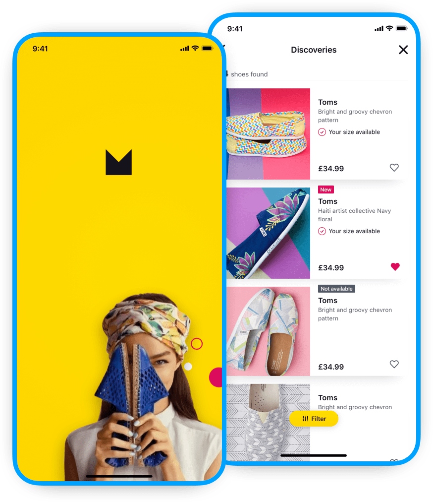
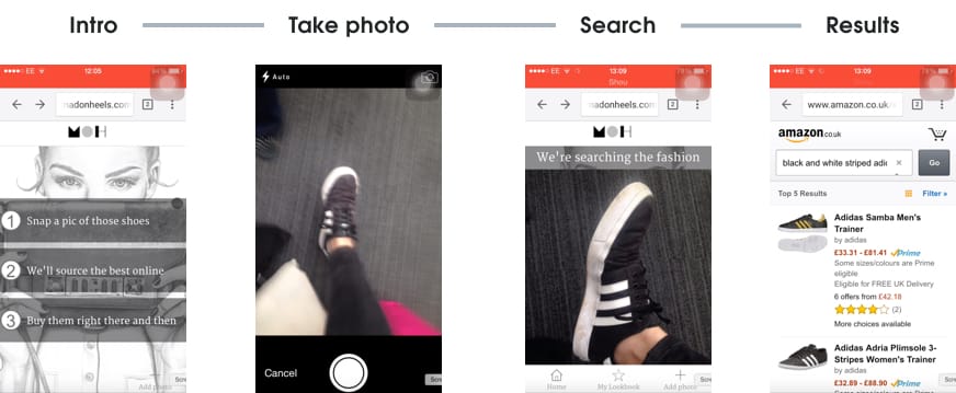
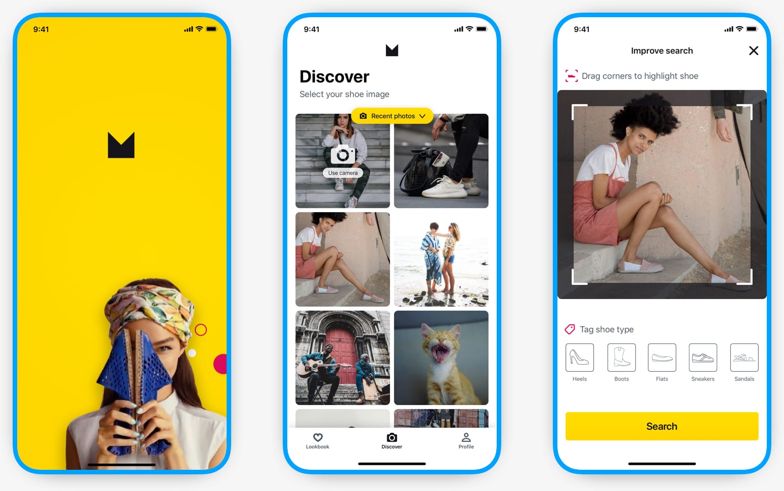
Our MVP gave shoe-lovers the ability to "in-the-moment" take a snap of shoes (found or seen anywhere) with their mobile phone and then, at a convenient time for them, bring up a visually curated list of shoes based on this photo. On top of this simple flow was a modern and bright visual aesthetic that would appeal to the fashion conscious user.
Read the in-depth casestudy below 🤓
A little context
Background
It started like most startup stories do 😉. Two product owners (Simon and Katy) kept hearing their fashion-loving friends talk about the latest fashion and not knowing where to buy similar items — specifically shoes in this case — and they decided to explore the problem space.
Their idea was simple, instead of someone having to do extensive online searches and figuring out the correct search terms to use, they could instead just take a photo of the item to get similar results and then purchase an item.
I joined them a few weeks later when they realised they needed a product designer to help conceptualise their idea. Our main goal (other than to have fun) was to come up with a product concept that we thought was worth pursuing.
The beginning
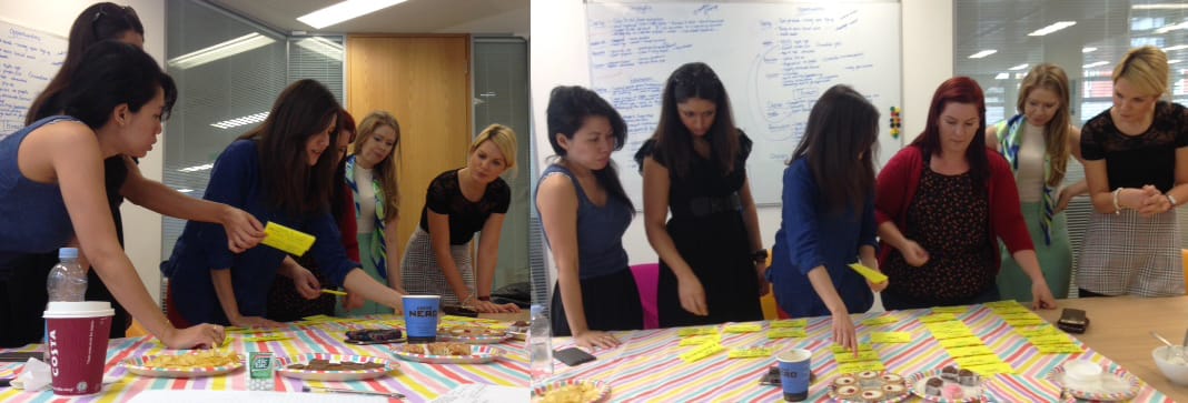
Research
Simon and Katy had done some initial research into the problem space with a survey, some interviews, and a workshop to better understand the target users. I came into the project just as we were doing the analysis of the research.
Research takeaways
People want help comparing and buying shoes online
Even if a person knows exactly what they are searching for they’d still like to know of similar options
Are shoe sizes “true to size”?
Online shoe shopping shows there is a range of discrepancies in sizing between companies
Pinterest was regularly used as a “lookbook”
Shoes found online were saved to boards in Pinterest, but these didn’t give you details or where to buy
Two types of fashionable shoe buyers emerged
1) Those that bought shoes as an “expression of themselves” and the emotional pleasure and 2) Those that were more concerned with comfort and “cost per wear” of shoes
OUR BIG INSIGHT
The experience should be about the discovery, not finding an exact match
Our primary user
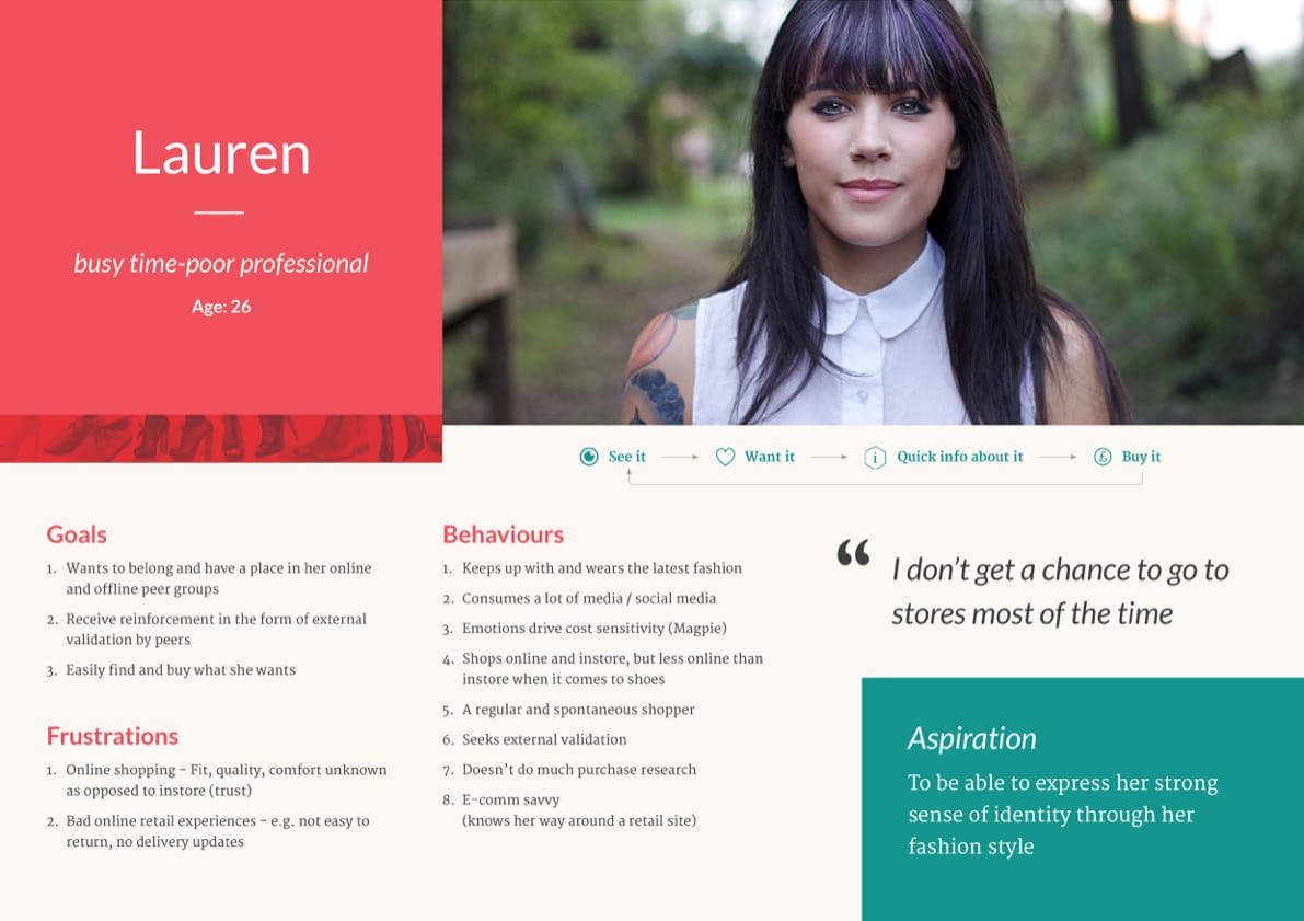
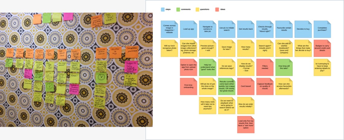
We collated what we learnt from our research into a persona to represent our behavioural audience segment. We did this by getting our workshop attendees to place themselves on a set of behavioural scales and then we could analyse later where clustering occurred. This was then used to flesh out our primary user whose goal is to discover a pair of shoes that make them feel good.

Meet Lauren
Our user is a busy professional who loves fashion and shoes, but doesn’t have the time to research and find a great pair of shoes. They get pleasure by showing off their latest shoe finds to their friends, but need help finding the shoes they want.
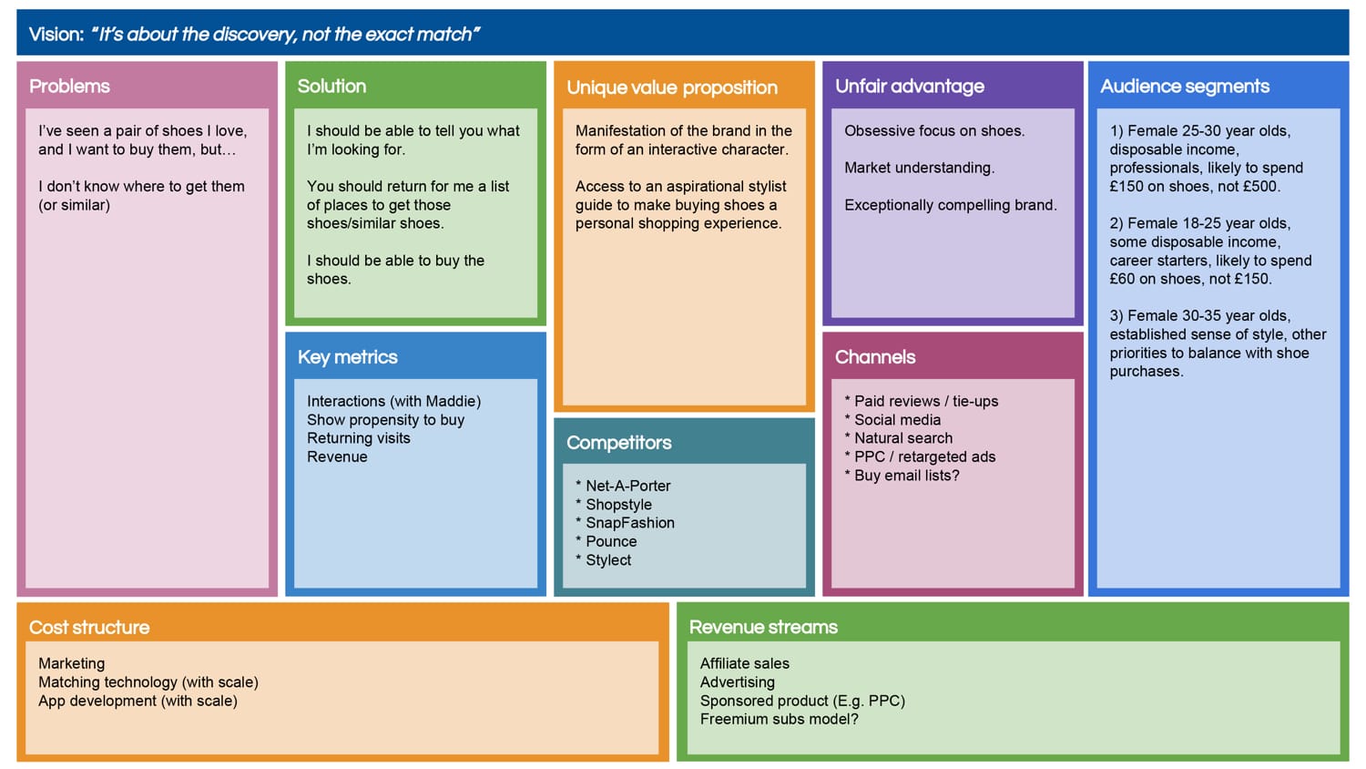
The lean canvas
We used the lean canvas approach (how could we not with two product owners 😉) to make sure we had a unified vision on the product and market fit. We would continually go back to this every few weeks to update with any new information or changes and to make sure we were still heading in the right direction.
The concept scope
We decided to concentrate on the most important part of the flow — the user journey from searching on an image to completion of a purchase. The question we wanted the concept to answer was, would our users get good enough results and information to make a purchase?
The litmus test
Early testiing
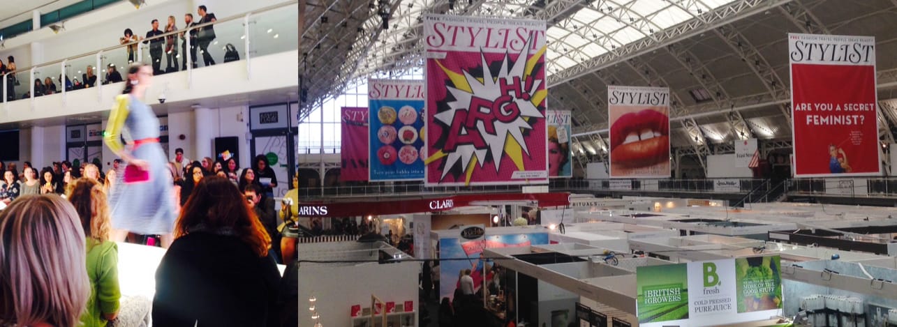
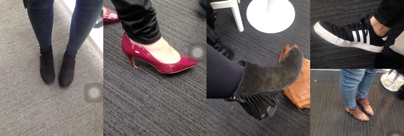
Early on we had the opportunity to test out the concept with real fashionistas at the London Stylist Live show. Katy had gotten herself an exclusive invite and we realised this was too good a chance to not get our idea in front of our target users.
Within a few days we had thrown together a responsive website using an open-sourced image matching SDK, Amazon for results, and some design assets to get the basic idea into a working state. Katy then spent the day (in-between socialising and watching fashion shows) finding willing participants to get their thoughts on our idea.
Testing takeaways
- Everyone understood the concept right away 😎
- People liked that it was focused purely on shoes
- People were unsure of the best way to take a photo ("Will this have an impact on my results?")
- The results took forever to return (Katy distracted them at this point 😅)
“It’s like Shazam, but for shoes!
We came away from this analysis pretty chuffed with how our crappy prototyped idea had been received, though we didn’t want to delude ourselves that reactions may have also been influenced slightly by the consumption of champagne. 🥂
Shoe discovery
The challenges
Standing out from the crowd
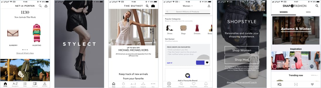
Looking around at the market we could see their were many products already trying to do the whole “take a picture and search to buy thing” — we needed some way to make ourselves stand out in this red ocean. When showing these products to our target users we kept hearing things like “they’re all pretty samey” and “they’re kinda bland”, and they would never be able to recall anything about the app at a later time. We saw this as the competitions lack of vision, branding, and audience focus and we needed a differentiator.
Brand personification
We decided to create a persona called Maddie to represent our brand. She would be the influence on our whole concept — someone who our users could relate to, help with a tone of voice, and steer the visual direction.
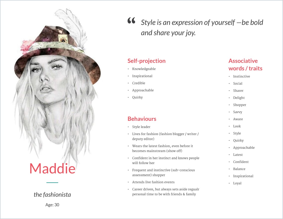
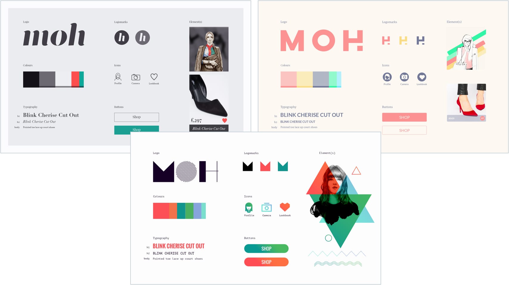
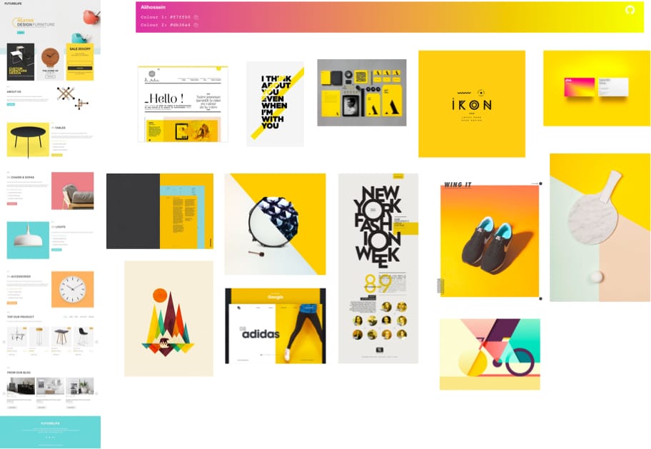
I settled on a vibrant two tone yellow and fuchsia palette as it was a colour palette that expressed playfulness and joy, set us apart from competitor branding, and visual styling that none of the other products were using.
I created guidelines around how these colours would be used:
- A minimal use throughout the rest of the UI when the user was actively engaged
- A pronounced use when Maddie was on screen and the user was passively engaged
- All text colours to meet AA contrast standards
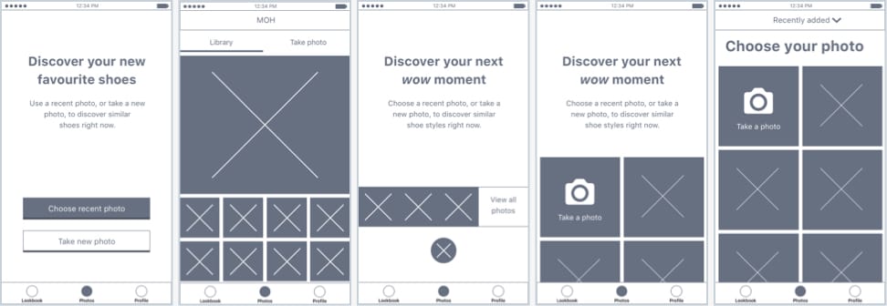
How will people use this?
We went through a few iterations of how our users would use the app in their day-to-day. Originally we assumed users would begin by opening the app to take a photo, but after some testing we found we were wrong about this — most users would take the photo “in the moment”, but they would actually use the app later to search on the photo. At this point I decided to create a scenario of how Lauren would use this app.
Lauren's scenario
Lauren is on her lunch break and on the way back from the sandwich shop she pops into retail store. There she sees some shoes she really likes, but she doesn’t have time to wait around for the right size so she takes a photo of them. Later on the train back home she remembers the shoes, opens our app, and searches for shoes based on her photo.
We also explored other scenarios with someone being at home flicking through a magazine, someone finding great shoes on Pinterest, and someone having a wedding to go to soon.
With this new behavioural knowledge we were able to create a flow that made a lot more sense to how people would actually use the app.
![[image: user scenarios, sketches, stories]](img/moh/storymap-sketch@1x.jpg)
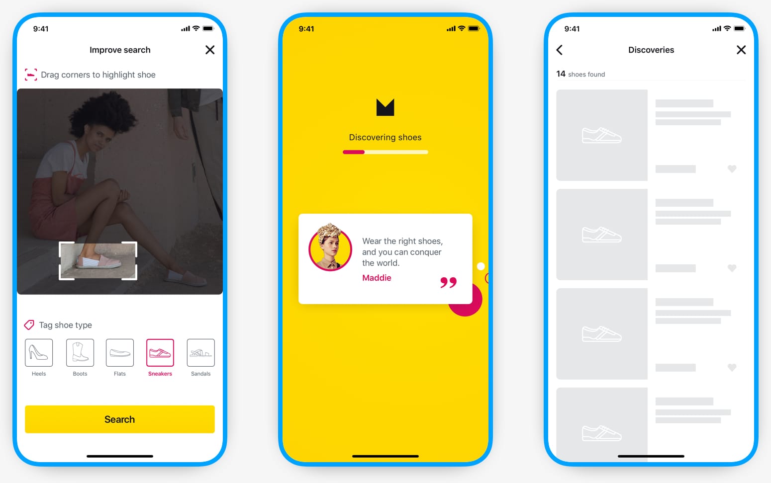
Search results return-time
After testing different image recognition APIs we settled on the one that produced the best results, but it came with a catch — it could take 5-8 seconds for results to appear to the user! 😔
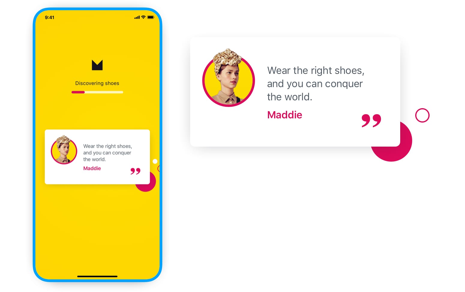
From previous experience I knew that a wait-time could be perceived to be faster by making a passive wait ("This is sooo long and boring!") into an active wait (time seems slower as user is occupied). I decided to break this active wait into two steps to not make the wait seem so long.
First interaction
The first screen was dedicated to the first 4 seconds of the wait. The screen included two things that would ease this wait for the user:
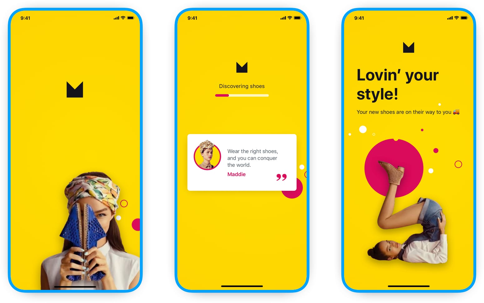
1. A quote from Maddie
This quote would change every time someone searched and I estimated it would take 2-3 seconds for users to read it
2. A progress bar
This was to allow the user to see something was already happening. The progress bar would never actually reach the end to give the perception that loading was happening faster than expected.
Second interaction
The next screen was the results screen, which would take up the remaining load time. This screen included:
1. Number of items returned
By this time we knew how many items would be shown to the user
2. Skeleton loading cards
The content details would still be loading into each card so I used a skeleton screen loader, which took 0.8 seconds to animate in
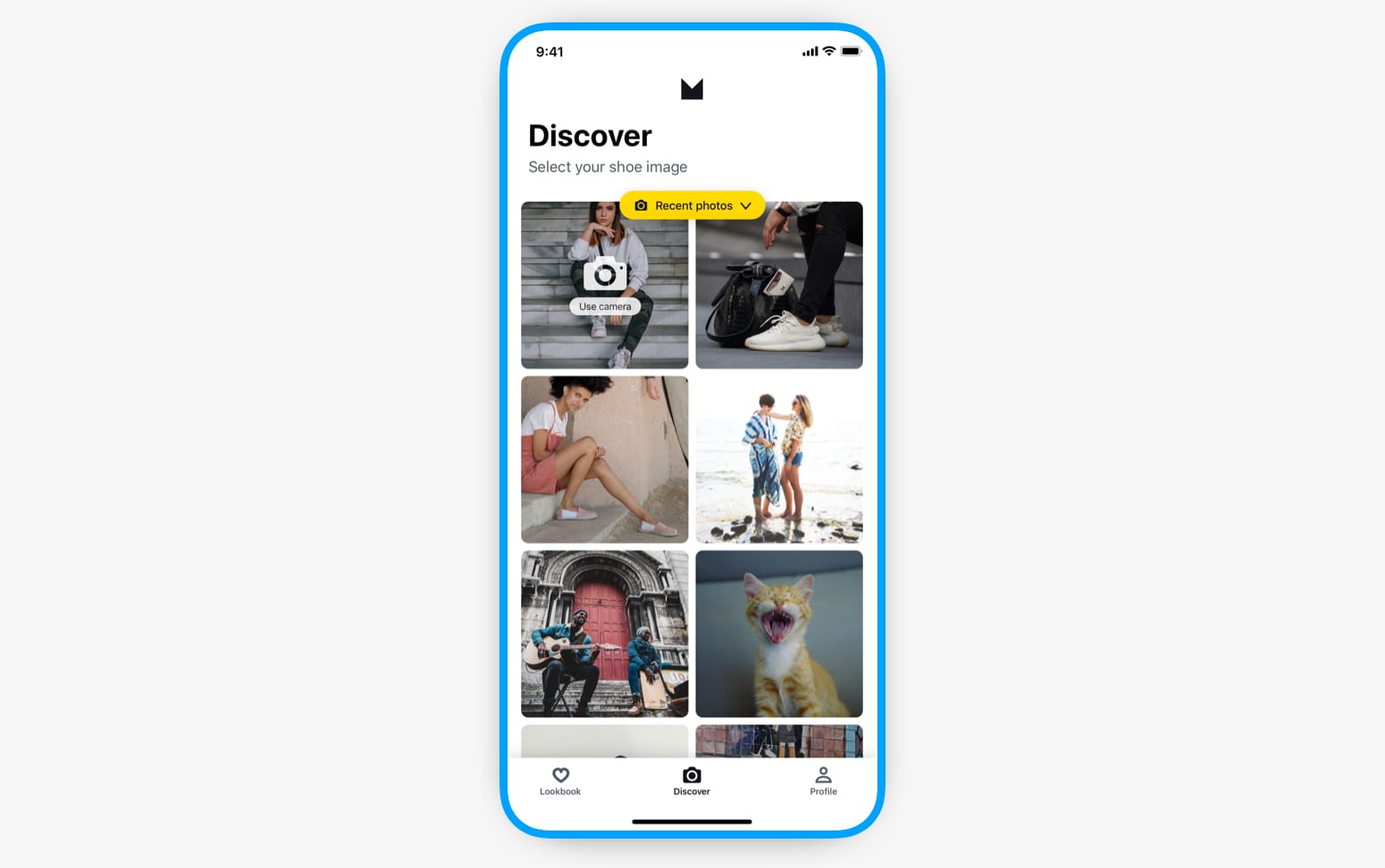
How to get a good image to use in search?
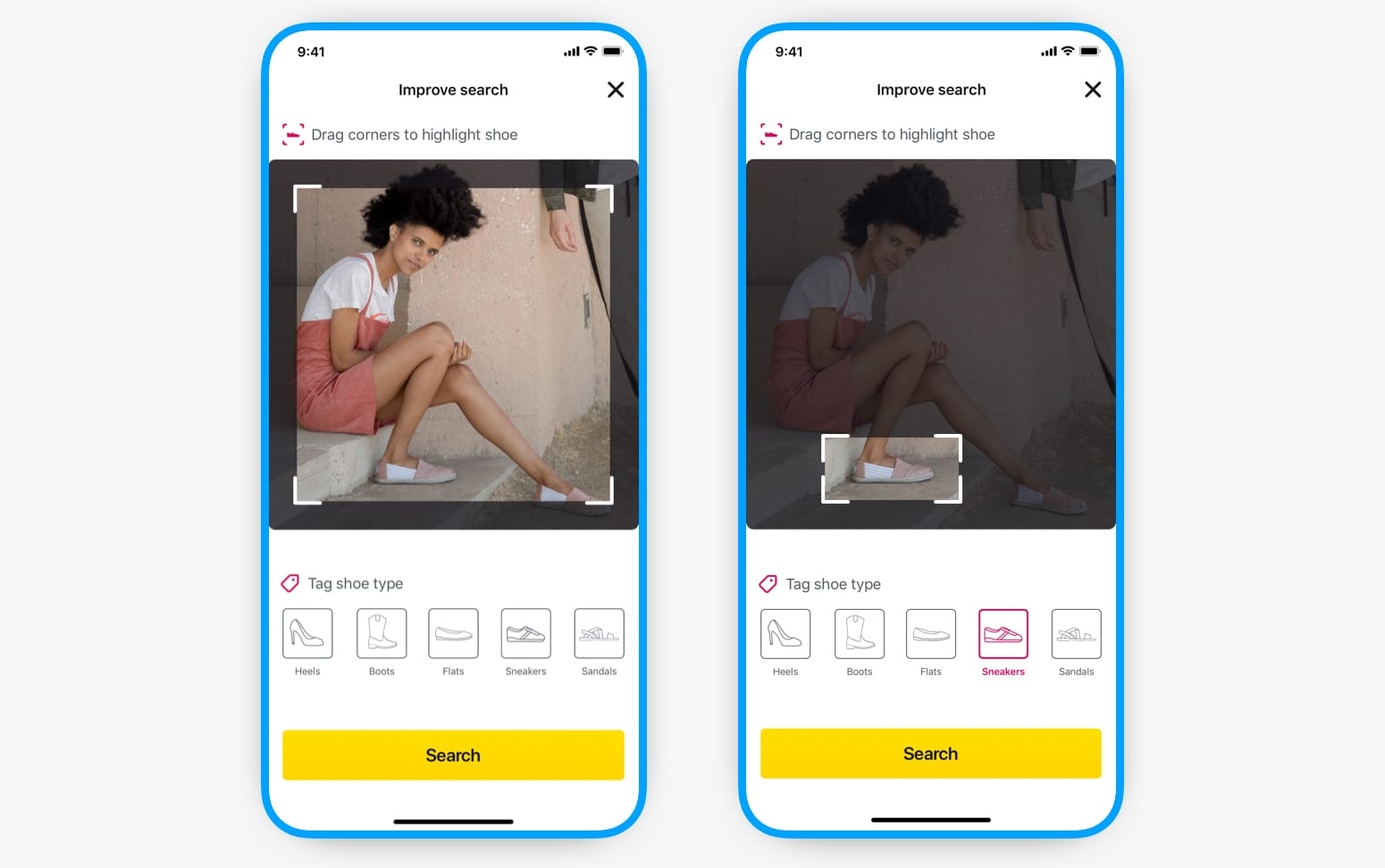
From testing the image recognition API we found that the best results came back from an image of one or both shoes included with as few other objects in the image as possible.
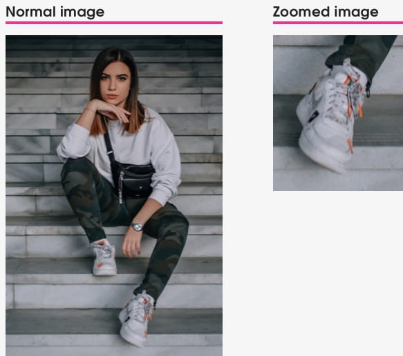
Obviously when people take photos (or use images from magazines or online) they’re usually not going to have an image of a beautifully zoomed in pair of shoes. We had to come up with a way for users to provide the best image for the API without it adding too much friction to the flow.
I sketched out multiple versions of ways to crop to just the shoe, including drawing around the shoe, but in the end we found that just the familiar drag to crop worked best. I had also played around with the user tagging the shoe type from a list which could help the image recognition algorithm further (a lot of images were tagged with this metadata) and we all decided to include it as it would definitely help with the results.
Importance of product details
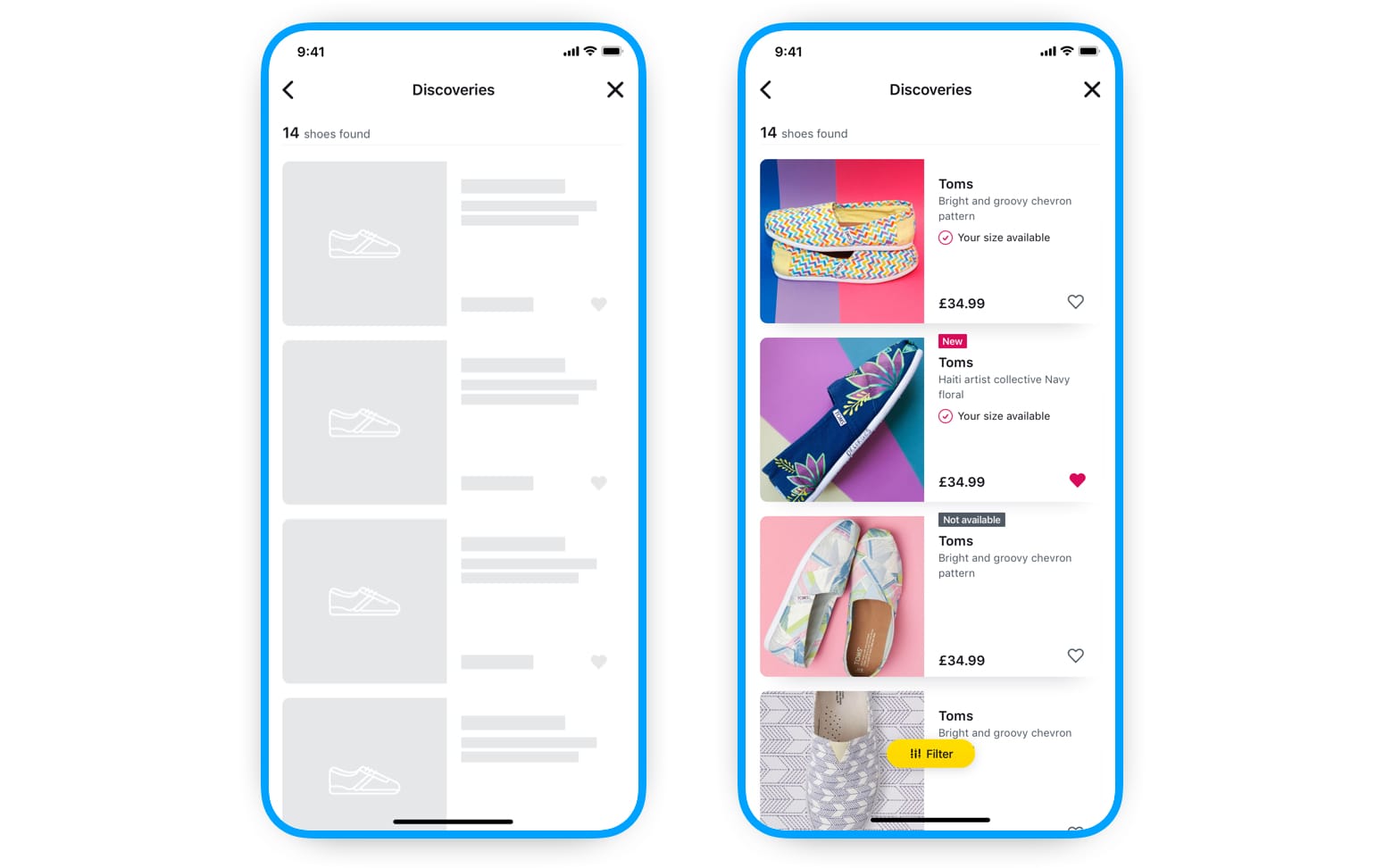
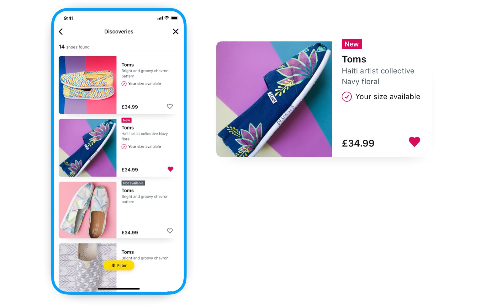
Shoe results list
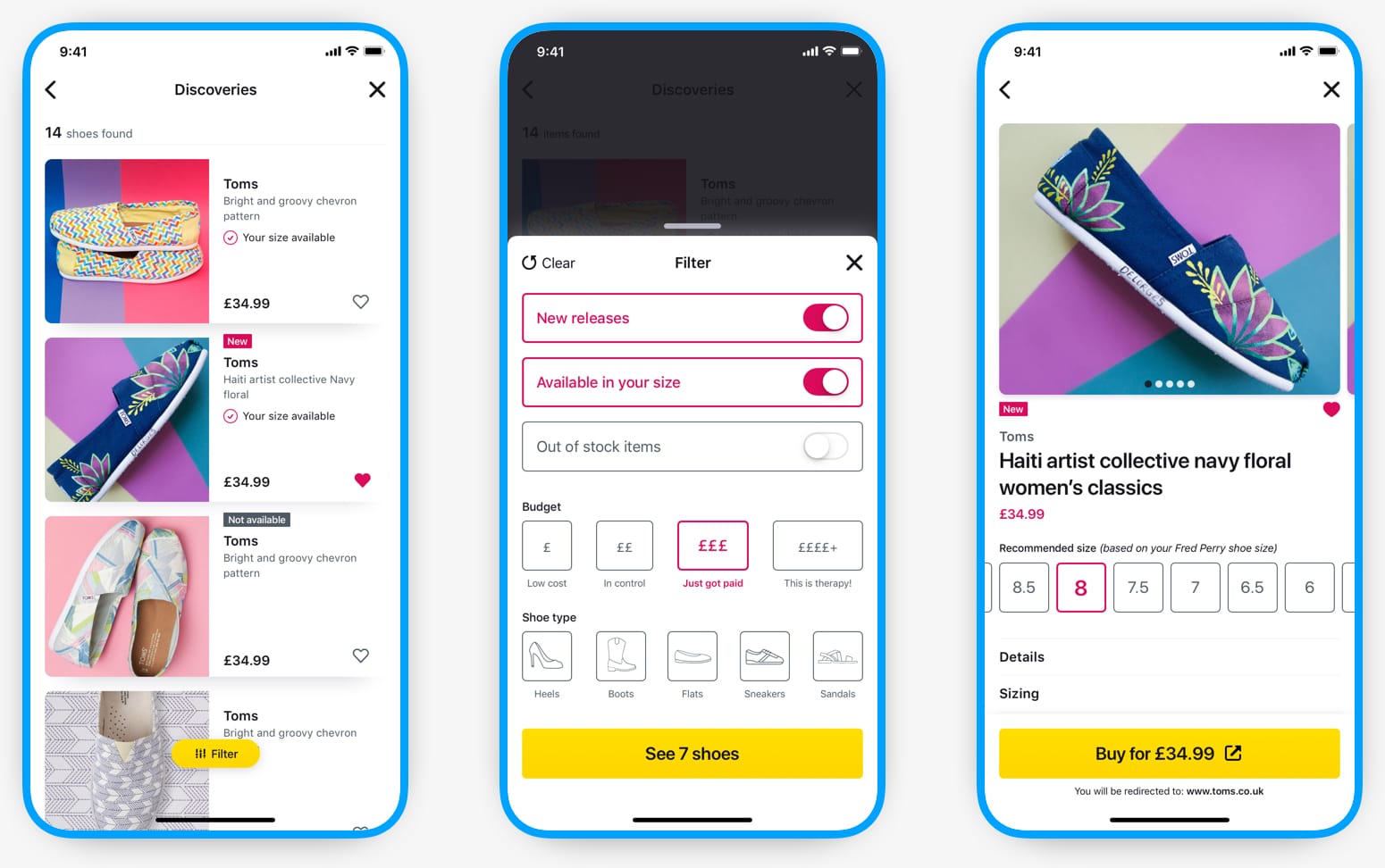
It was crucial to provide users with adequate product information on the results list so it would help them with shoe comparisons and overview before selecting a shoe they're interested in.
The most important pieces of information for our users would be available in right size, out of stock, new item, brand name, short description, price, and being able to save it to their lookbook.
Full shoe details
Once the user knew which shoe they wanted to view we would show them: more images of the shoe, size selection (which would default to the recommended size based on previous purchases), delivery information, return policies, and sizing information. Information such as delivery data was not always available to us though, so we decided to just not show any piece of data that was not provided by the API.
![[image: Full details screen]](img/moh/shoe-details@1x.jpg)
Final UI
Ending it together
Outcome
After working on the concept for about five months we began asking ourselves how we could make Maddie more personal to the user — almost like a fashion confidant. We felt this was our biggest differentiator and we wanted to expand upon it.
We started to explore turning Maddie into a conversational UI experience, even talking about doing away with the app concept and building a Facebook Messenger bot instead. We spent the next month working on how the user would interact with Maddie to discover shoes, the scripting of how the communication between the user and Maddie may work, and the many branching scenarios that this could throw up.
It was at this stage that we came to the realisation that the concept we originally had was starting to morph into something else. Understanding why this was made us aware that there were some products already doing what we wanted to do and they were way ahead of us. To continue moving forward with our concept would require much more commitment of time, effort, and money — which in the end we were not willing to commit.
So we ended the concept there and moved on with our lives. 😇
Closure...
I still thought there was value in continuing to build the core concept into the high-fidelity prototype that we had envisioned. Maybe I was too attached to the idea to let it go so quickly, but being able to see it through to the hi-fi prototype stage created a sense of accomplishment and a better ending then where we would have left it. 🤓
Reflections
Sometimes it’s all about timing
If we had done this two years later we would have had a plethora of open-source image recognition APIs, machine learning tools, and AR tools at our disposal which could have made a lot of the technical obstacles we came up against a lot easier to circumnavigate. So why don’t we get together and give it a go now then? Well people move on with their lives, have babies, move away, and now sadly the right time is the wrong time for us.
Side projects with friends
Working on any side project is a great way to get away from the usual serious work-related headspace and do something fun and exciting — doing it with friends makes it even more so. But slowly coming to the realisation that to continue the side project meant plowing a lot more time, effort, and money into it (and possibly losing the fun element) was probably one of the key factors to ending it. It went from a low-pressure, low-risk, labour of love to something that began to feel like a “job” — and that’s not why you’re doing it.
Solve the “little” problems
Although we had uncovered some great insights in the research stage, such as shoe sizes not matching and shoe comfort, as we developed our MVP concept we pushed a lot of these problems aside for later. I feel that if we had really wanted to differentiate ourselves from others we could have dived much deeper into these problems — instead of focusing on the “happy path” concept. These problems affect a lot more shoppers online and so would have been more beneficial to a wider range of our users.